
Technology newsroom
Build Excel Dashboards with AI: Simple Commands, Professional Outcomes
Learn how to use AI in Excel, such as Copilot, to create professional dashboards. This guide covers data preparation, using simple and clear commands, and verifying accuracy, transforming raw data into intuitive and interactive summaries in just a few steps.
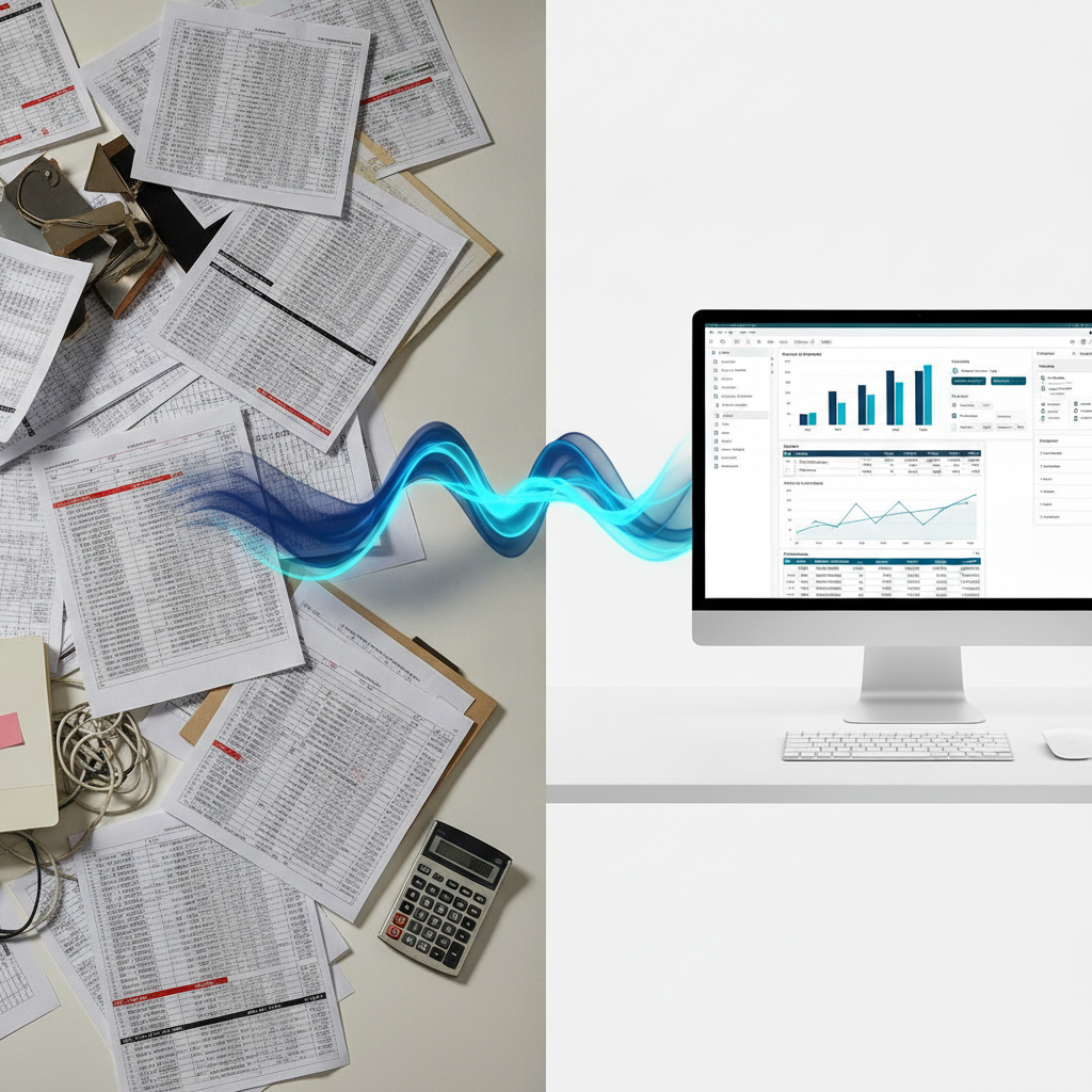
Often, office workers or SME owners encounter Excel files brimming with raw data, yet presenting this information in an engaging and easily understandable way remains a challenge. This article introduces how to use AI tools in Excel (such as Copilot) to transform that data into beautiful, interactive dashboards, focusing on using simple commands to achieve powerful results.
### Understand Before You Act
An Excel Dashboard is a data summary page that consolidates essential charts, tables, and key performance indicators onto a single screen, providing a quick overview of data and trends. Traditionally, creating dashboards required expertise in complex formulas, PivotTables, and chart creation.
AI tools in Excel help streamline these steps, acting as intelligent assistants. We can type commands in plain language to instruct AI to analyze data, create charts, or summarize results instantly. The key is not to write complex commands, but to prepare your data for use and communicate your needs clearly and directly.
### Before You Begin
Before you start giving commands to AI, ensure your data is prepared to allow the AI to work as accurately and precisely as possible.
1. **Back Up Your Data:** The most crucial step is always to work with a "copy" of your data file to prevent any potential errors from affecting your original data.
2. **Prepare Clean Data (Data Cleansing):** AI works best with clearly structured data. Ensure your data:
* Is in a table format with clear column headers in a single row.
* Does not contain merged cells within the data.
* Does not have empty rows or columns interrupting the data.
* Contains consistent data types in each column (e.g., date columns should only contain dates, number columns should only contain numbers).
3. **Define Your Goals:** Briefly note what you want to see in your dashboard, such as "Monthly sales vs. target," "Top 5 best-selling products," or "Customer proportion by region." Having clear goals will help you create more relevant commands.
### How to Proceed Safely
Follow these steps to systematically create your first dashboard with AI.
**1. Format as Table**
* **WHAT:** Change your plain data range into a structured Excel table.
* **WHERE/HOW:** Select all your data (click any cell in the data and press `Ctrl+A`), then go to the `Insert` tab > `Table`, and click OK.
* **WHY:** This officially makes Excel and AI recognize the data boundaries, greatly simplifying referencing and analysis.
* **EXPECTED RESULT:** Your data will transform into an alternating banded table, and filter arrows will appear on each column header.
**2. Open AI Copilot Window**
* **WHAT:** Open the AI tool to start typing commands.
* **WHERE/HOW:** Look for the `Copilot` icon on the Ribbon, typically found on the `Home` tab. Click it to open the chat sidebar.
* **WHY:** This window is your primary channel for communicating with and commanding the AI.
* **EXPECTED RESULT:** A Copilot sidebar will appear on the right side of your screen, ready for you to type questions or commands.
**3. Start with Simple Data Exploration Commands**
* **WHAT:** Experiment by asking broad questions to have AI analyze the data overview.
* **WHERE/HOW:** In the Copilot chat box, type simple commands like `“Summarize the data in this table”` or `“Show interesting insights from this dataset.”`
* **WHY:** This tests if the AI understands your data structure and gives you initial ideas about interesting points within your data.
* **EXPECTED RESULT:** AI will display a summary in text, create a summary table, or generate simple charts as guidance.
**4. Command AI to Create Desired Charts and Tables**
* **WHAT:** Instruct AI to create the main components for your dashboard.
* **WHERE/HOW:** Type specific and clear commands, stating the chart type and data you want to display, such as `“Create a bar chart comparing total sales by product category”` or `“Create a PivotTable showing the average sales for each employee.”`
* **WHY:** This step involves creating various dashboard elements according to your defined goals. Specifying the chart type will help achieve more precise results.
* **EXPECTED RESULT:** AI will create the chart or PivotTable as instructed, either on a new sheet or next to your data table.
**5. Request Data Slicers**
* **WHAT:** Add interactive buttons for filtering data, making your dashboard responsive to users.
* **WHERE/HOW:** After the AI creates a chart or table, type the next command, such as `“Add Slicers for the 'Branch' and 'Year' columns to the latest PivotTable.”`
* **WHY:** Slicers are powerful tools that allow users to select and view specific data, such as sales for only 2023 or only the Bangkok branch, significantly enhancing the dashboard's utility.
* **EXPECTED RESULT:** Filter boxes with buttons will appear, which you can click to instantly filter data in the linked charts and tables.
**6. Gather and Arrange Components on a New Sheet**
* **WHAT:** Gather and arrange all charts, tables, and Slicers you've created onto a single sheet.
* **WHERE/HOW:** Create a New Sheet and name it “Dashboard.” Then, Copy and Paste all elements from different sheets onto this sheet, arranging them neatly for easy viewing.
* **WHY:** A good dashboard should summarize everything on one page. Good arrangement guides the eye and simplifies data interpretation. While AI can create components, the final layout still requires manual effort.
* **EXPECTED RESULT:** You will have a complete “Dashboard” sheet, ready for use.
### Review the Results
After creating your dashboard, check for accuracy to ensure the displayed data is reliable.
1. **Test Slicer Functionality:** Try clicking different filters, such as selecting a year, month, or branch, and observe whether all charts and tables update correctly.
2. **Spot Check Numbers:** Choose a small data point on a chart (e.g., sales of product A in January) and cross-reference it with the raw data to see if the numbers match.
3. **Check for Clarity:** Ask a colleague or someone unfamiliar with the dataset to view the dashboard and inquire if they understand the overview. If they can summarize key insights without additional explanation from you, your dashboard is a success.
### If Issues Persist
If AI cannot produce the desired results, consider these potential causes:
* **AI Doesn't Understand the Command:** Most issues arise from improperly prepared data. Revisit the "Before You Begin" steps, especially formatting data as a Table and eliminating merged cells.
* **Incorrect Results:** Your command might be too broad or ambiguous. Try refining your command to be more specific. For example, instead of `“Show me sales charts,”` change it to `“Create a line chart showing total monthly sales for the entire year.”`
* **When to Seek Help:** If your data is highly complex, requires specialized formulas that AI cannot yet handle, or is subject to company security policies regarding AI usage, consult your IT department or an Excel expert for further guidance.
### Conclusion
AI tools in Excel are powerful assistants for rapidly transforming complex data into easy-to-understand dashboards. The key to success is not attempting to create complex commands, but starting with clean, well-structured data and using simple, clear instructions to ensure AI understands and generates the precise results you need.